
Barbie Exhibition @the Design Museum, London
- beccalaing
- Nov 20, 2024
- 2 min read
On Tuesday 19th of November, I visited the Barbie Exhibition at the Design Museum ahead of an evening talk from Sarah Greenwood and Katie Spencer (a seven-time Academy Award nominated and eight times BAFTA nominated Stage and Production Designer duo) in relation to their roles in designing the set for the Barbie movie, 2023.
The evening was chaired by the Design Museum's senior curator, Danellie Thom who had been responsible for the Design Museum exhibition and able to bring her own understanding and knowledge about Barbie - including insights direct from Mattel - to the evening, making it extremely informative.
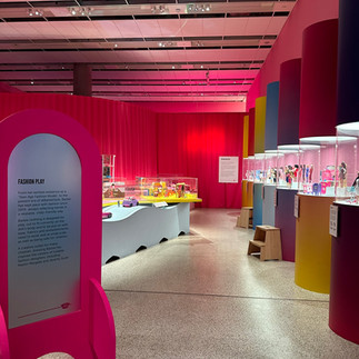
The exhibition itself was beautifully laid out and discussed extensively the design process and adaptions made by Mattel to ensure that Barbie remains current and iconic as a 'dream doll'. The exhibition demonstrated the importance of design both in the success of the product, and in the exhibition layout itself.
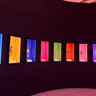
The bright colours (not just pink) particularly stood out to me as it was clear they had been purposefully chosen to evoke nostalgic feelings of play, confidence, and joy, awakening an inner-child in all visitors.


This theme of child-like play was further discussed in the evening talk, where Greenwood and Spencer both discussed director Greta Gerwig's vision for the film centring around this, and her brief to the set directors that it must 'look beautiful'.
Within this they spoke around props on-set which where made to scale for the Barbie Dolls Vs. which props where made to scale for the children who would be playing with the dolls, such as the hairbrush. Mattel themselves had discussed this user-metric with Thom when designing the exhibition and I learned the term 'Toyetics' which describes this.
The colour pink was also discussed and it was revealed that Mattel themselves meet frequently to debate what exact shade best fits the renown 'Barbie Pink' within a current market. Understanding that something so recognisable adapts and changes to remain competitive should perhaps not have come as a surprise... and yet, I would not have assumed this shade to have been a debatable pantone! Greenwood and Spencer discussed the pink that had been used on set for the Barbie design which, under Gerwig's direction, had been described as needing to fit on a scale between 'Millennial Pink' (Light Salmony pink, according to Gerwig) and 'Pornstar Pink' (A purple, magenta shade of pink, according to Greenwood).

The debate relating to the colour pink really engaged me, and bought home the importance for individual design decisions when trying to deliver a product which delivers a specific need to ensure the consumer desirability is achieved.
To visit the exhibition yourself, you can book tickets: Barbie®: The Exhibition - Design Museum
Comments